Falcony Tenant Portal update: Surveys, QR-Codes and more branding options
As you may have noticed, the expectations of commercial tenants have shifted to more transparency, timely communication and being available almost 24/7. With our Falcony | Tenant Portal product we are always seeking to help you match these expectations. In this blog we'll show our latest releases: tenant satisfaction surveys, QR-code printouts and more colouring options for front page buttons.
This is the third blog post from our recent launch event (link goes to YouTube) held on the 16th of November 2023. The previous blog posts can be read here:
- Falcony Launches idea generation solution.
- Product update: Deleted items, Datatables and Observation lifetimes
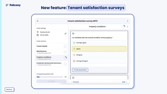
Tenant satisfaction surveys
We’ve been for quite a while considering how we can show with numbers that tenant portals actually increase the tenant experience and satisfaction. And now we are proud to release a tenant satisfaction survey solution for this.
This allows customers to customise the surveys, but to simplify the implementation, we’ve added two templates, one pulse survey that’s being automated once a month and a longer satisfaction survey one that gets sent annually to the tenant's main contacts. Both provide different sets of data points to make the tenant experience more transparent.

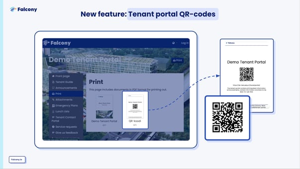
QR-Code printouts
A common question we get from our customers is how to get tenants to know about the portal and come back there. To make that happen, they need to be reminded about it often.
To solve the reminding hassle, it is now possible generate branded QR-codes that can be printed out from the tenant portal to for example lobby, elevators or in the stairwells of the building. When tenants pass them by, they will be visually reminded to visit the tenant portal front page.

More colours for the front page buttons
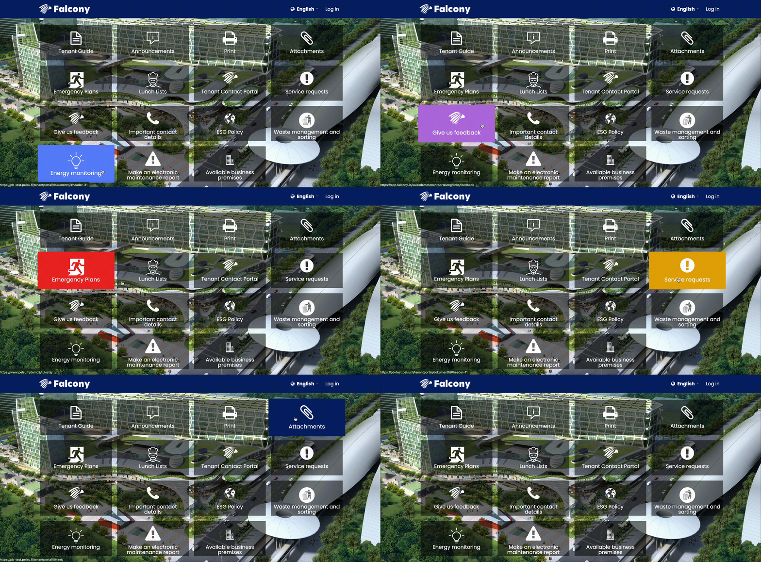
It’s now possible to customize the colors of the buttons in the tenant portal open front page. What this means in practice is that instead of having all buttons with the same colors, each and every button can be customized to chosen colors allowing for example:
- Emergency plan buttons to be coloured as Red
- Sustainability and ESG document buttons to be coloured as Green
The options are pretty much limitless as customers can use what ever colour codes they want.

Stay tuned for more releases in the upcoming weeks and months.
Are you interested to discuss how our new features could benefit your organisation? Contact us and let's make it happen!
We are building the world's first operational involvement platform. Our mission is to make the process of finding, sharing, fixing and learning from issues and observations as easy as thinking about them and as rewarding as being remembered for them.
By doing this, we are making work more meaningful for all parties involved.
More information at falcony.io.
Conclusion
We are building the world's first operational involvement platform. Our mission is to make the process of finding, sharing, fixing and learning from issues and observations as easy as thinking about them and as rewarding as being remembered for them.
By doing this, we are making work more meaningful for all parties involved.
More information at falcony.io.

Related posts
Product update: Deleted items, Datatables and Observation lifetimes
As we are on a mission to help companies involve their extended workplace, we are pleased to...
Services update: Sandbox, Outsourced admin and New training packages
Our latest launch event was not just about fresh new features that our magnificent development...
Friction: the number one killer of organisational habits
The resistance that one surface or object encounters when moving over another.


